I like Andy’s idea here: .wrapper { width: clamp(16rem, 90vw, 70rem); margin-left: auto; margin-right: auto; padding-left: 1.5rem; padding-right: 1.5rem; } Normally I’d just set a max-width there, but as Andy says:
This becomes a slight issue in mid-sized viewports, such
…
The post Use CSS Clamp to create a more flexible wrapper utility appeared first on CSS-Tricks. You can support CSS-Tricks by being an MVP Supporter.
https://piccalil.li/quick-tip/use-css-clamp-to-create-a-more-flexible-wrapper-utility
Melden Sie sich an, um einen Kommentar hinzuzufügen
Andere Beiträge in dieser Gruppe

Layout. It’s one of those easy-to-learn, difficult-to-master things, like they say about playing bass. Not because it’s innately difficult to, say, place two elements next to each other

I was playing around with scroll-driven animations, just searching for all sorts of random things you could do. That’s when I came up with the idea to animate main headings and, using scroll-driven

This is the fourth post in a series about the new CSS shape() function. So far, we’ve covered the most common commands y
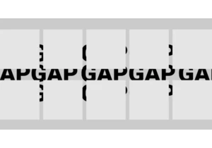
Styling the space between layout items — the gap — has typically required some clever workarounds. But a new CSS feature changes all that with just a few simple CSS properties that make it easy, ye

Being the bad boy I am, I don't take Tailwind's default approach to cascade layers as the "best" one. Over a year experimenting with Tailwind and vanilla CSS, I've come across what I believe is a b


KelpUI is new library that Chris Ferdinandi is developing, designed to leverage newer CSS features and Web Components. I've enjoyed following Chris as he's publishe