Thin fonts are like that trendy minimalist couch that looks amazing in photos but is absolutely terrible to sit on. Designers have obsessed over them for years, treating them as a symbol of elegance, sophistication, and high-end branding. But let’s be real: thin fonts are a usability and accessibility disaster. https://webdesignernews.com/thin-fonts-are-a-usability-nightmare/
Melden Sie sich an, um einen Kommentar hinzuzufügen
Andere Beiträge in dieser Gruppe

To be honest, I was a smidge skeptical. I know what a design token is. It’s a variable of a color or font-family or something. I pretty much only work on websites, so that exposes itself as a --custom
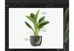
Transform your website from flat to flourishing with interactive animations that enhance user experience. https://webdesignernews.com/micro-animations-every-web-developer-can-master-with-rive/
I have a confession to make. For the first year or so, I used GitHub Copilot like a glorified spell-checker. A really, really smart spell-checker, sure—one that could write a whole function instead of
We’ve all been there. You find a stock graphic labeled “premium,” pay the extra fee, and then realize it still looks cheap in your design. https://webdesignernews.com/what-makes-a-stock-graphic-truly-
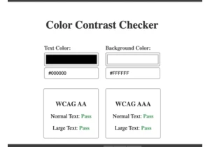
In this tutorial, we’ll create a color contrast tool that lets you check the accessibility and readability of text, by comparing the ratio between background and foreground colors. https://webdesigner

From giant inflatable glyphs to welcoming soundscapes, Figma’s Brand Studio designed an immersive conference that celebrated the spirit of makership at every turn. https://webdesignernews.com/how-we-s

I’m enjoying these FAQ style articles. Today I’m digging into 7 questions that companies have asked me in recent months with the help of Cindy, Garron, Gustavs and Nad. https://webdesignernews.com/faq
