A huge part of building for the web is making experiences responsive. Usually, we think of responsive design in terms of making sites adapt to different viewport sizes, but what about being responsive to different mediums too? https://webdesignernews.com/printing-the-web-making-webpages-look-good-on-paper/
Melden Sie sich an, um einen Kommentar hinzuzufügen
Andere Beiträge in dieser Gruppe
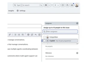
In this post we’ll explore the concept of AI agents as software engineers on your development team. https://webdesignernews.com/coding-agents-are-here-is-your-team-ready-for-ai-devs/

This guide focuses on how to structure and present UX requirements so they’re both practical and insightful. When developers understand the “why” behind each UX choice, they’re far more likely to impl

Like many designers early in their careers, I believed my role began and ended with wireframes, pixels, and prototypes. My manager thought otherwise. He was obsessed with UX analytics. Every design ch

OpenAI has released GPT-5, and early testers are calling it the closest we’ve come to Artificial General Intelligence (AGI). This isn’t just a smarter chatbot — GPT-5 is a tool-using AI agent th

OpenAI has launched GPT-5, a new flagship AI model that will power the company’s next generation of ChatGPT. https://webdesignernews.com/openais-gpt-5-is-here/
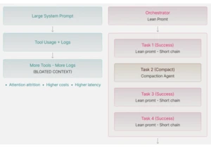
I’ve been skeptical about prompt engineering for a long time, it seemed more like shaman rituals rather than anything close to engineering. All those approaches “I will tip you $100” or “My grandmothe
In the ever-evolving world of design, where innovation meets aesthetics, finding the perfect resources to fuel your creative journey can be a rewarding yet daunting task. As a designer myself I took t