This article has no byline and is on a website that is even more weirdly specific than this one is, but I appreciate the trick here. A seven-column grid makes for a calendar layout pretty quick. You can let the days (grid items) fall onto it naturally, except kick the first day over to the correct first column with grid-column-start. Thoughts:
I’d go with an rather than a just because it seems like days are definitely ordered.
… Read article “A Calendar in Three Lines of CSS”
The post A Calendar in Three Lines of CSS appeared first on CSS-Tricks. You can support CSS-Tricks by being an MVP Supporter.
https://calendartricks.com/a-calendar-in-three-lines-of-css/
Inicia sesión para agregar comentarios
Otros mensajes en este grupo.
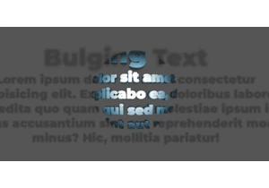
In this third and final chapter, we’re stepping into interactivity by adding JavaScript, starting with a simple :hover effect, and ending with a fully responsive bulging text that foll

In this chapter, we will explore ways to animate the effect, add transitions, and play with different variations. We will look at how motion can enhance depth, and how subtle tweaks can create a wh

A client asked me to create a bulging text effect. With a bit of cleverness and some advanced CSS, I managed to get a result I’m genuinely proud of, which is covered in this three-part series.


