A little while back, Chris shared this nice hexagonal grid. And true to its name, it’s using —wait for it — CSS Grid to form that layout. It’s a neat trick! Combining grid columns, grid gaps, and creative clipping …
The post Hexagons and Beyond: Flexible, Responsive Grid Patterns, Sans Media Queries appeared first on CSS-Tricks. You can support CSS-Tricks by being an MVP Supporter.
https://css-tricks.com/hexagons-and-beyond-flexible-responsive-grid-patterns-sans-media-queries/
Inicia sesión para agregar comentarios
Otros mensajes en este grupo.
Gathered notes on Liquid Glass, Apple’s new design language that was introduced at WWDC 2025. These links are a choice selection of posts and resources that I've found helpful for understanding the

Layout. It’s one of those easy-to-learn, difficult-to-master things, like they say about playing bass. Not because it’s innately difficult to, say, place two elements next to each other

I was playing around with scroll-driven animations, just searching for all sorts of random things you could do. That’s when I came up with the idea to animate main headings and, using scroll-driven

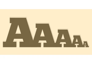
This is the fourth post in a series about the new CSS shape() function. So far, we’ve covered the most common commands y
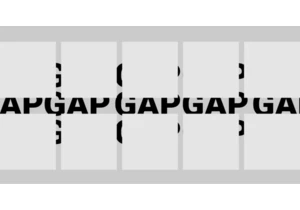
Styling the space between layout items — the gap — has typically required some clever workarounds. But a new CSS feature changes all that with just a few simple CSS properties that make it easy, ye