Recently, Twitter unveiled a new design for its website and app, including a new font, higher-contrast colors, and less visual clutter. According to Twitter Design, the changes are meant to make the platform more accessible and allow users to be more focused. https://webdesignernews.com/why-do-people-hate-redesigns/
Inicia sesión para agregar comentarios
Otros mensajes en este grupo.

Create WCAG-compliant infographics with expert tips on alt text, contrast, and screen reader support. Make your visuals accessible to all. https://webdesignernews.com/implement-wcag-rules-in-your-info
If you often just obsessively nudge pixels until your sanity starts to fray… This painfully relatable (and slightly unhinged) journey through the 7 stages of pushing pixels is for you! If you’ve ever
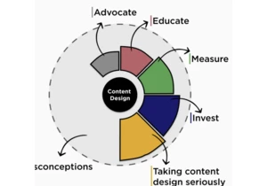
Content design. The somewhat forgotten practice that guides users from A to B. That structures information. That plays a simple yet powerful role in shaping user experience (UX). The unsung hero of de
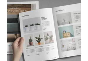
A product catalog does more than list what you sell, it can also help shape how people see your brand. A clean, well-structured layout can make your products easier to browse and more appealing to pot


