A radar chart — also commonly called a spider chart — is yet another way to visualize data and make connections. Radar charts are inherently geometric, making them both a perfect fit and fun to make with CSS, thanks to the polygon() function. Read along as Preethi Sam demonstrates the process and sprinkles it with a pinch of JavaScript to make a handy, reusable component.
https://smashingmagazine.com/2024/02/draw-radar-charts-web/
Login to add comment
Other posts in this group

The Wizard of Oz method is a proven UX research tool that simulates real interactions to uncover authentic user behavior. Victor Yocco unpacks the core principles of the WOZ method, explores advanced

Traditional page builders have shaped how we build WordPress sites for years. Let’s take a closer look at Droip, a modern, no-code visual builder, and explore how it redefines th

As always in design, timing matters, and so do timely notifications. Let’s explore how we might improve the notifications UX. More design patterns in our <a href="https://smart-interface-design-patter

CSS has evolved from a purely presentational language into one with growing logical powers — thanks to features like container queries, relational pseudo-classes, and the if() function. Is it still

Bridging the gap between user research insights and actual organizational action — with a clear roadmap for impact. https://smashingmagazine.com/2025/07/turning-user-research-into-organizational-chang
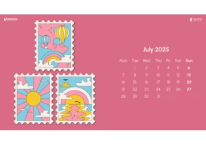
July is just around the corner, and that means it’s time for a new collection of desktop wallpapers. Created with love by artists and designers from across the globe, they are bound to bring some good

As online scams become more sophisticated, Carrie Webster explores whether good UX can serve as a frontline defense, particularly for non-tech-savvy older users navigating today’s digital world. https
