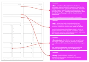
The goal of content design is to reduce confusion and improve clarity. Yet often it’s difficult to pinpoint a problem as user feedback tends to be not specific enough. But: we can use a few simple techniques to assess how users understand and perceive content. Let’s take a look. Part of Smart Interface Design Patterns by yours truly. https://webdesignernews.com/how-to-test-and-measure-content-in-ux/
Login to add comment
Other posts in this group
Discover OpenAI’s GPT-Image-1, a powerful AI image generation model that creates stunning visuals from text prompts. https://webdesignernews.com/gpt-image-1-complete-guide-to-openais-revolutiona

I write, to think. More than anything this essay is an attempt to think through a bunch of hard, highly speculative ideas about how AI might unfold in the next few years. A lot is being written about

If you’ve ever shipped a product or owned a software business, you know this: writing code isn’t the real bottleneck for business, of-course the teams could be faster, could have less tech

Like most things, the term started off with good intentions. A way to suggest fixes for things which are definitely accessibility barriers, but don’t technically fail the Web Content Accessibili
Current AI interfaces lull us into thinking we’re talking to something that can make meaningful judgments about what’s valuable. We’re not — we’re using tools that are tremendously powerful but noneth
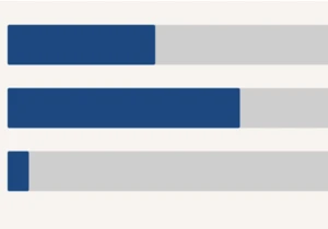
We sent these questions to 913 design system nerds and received 57 responses. After reviewing the data, we saw a story forming…one of awkward spreadsheets, elegant code instrumentation, a bit of organ
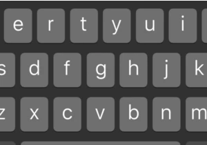
On iOS, these are in the tertiary keyboard. You have to go to the keyboard with the numbers and common symbols then click the symbols button to see the angle brackets. Then you need to swap back to th
