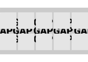
As awesome as flexbox is, what it’s doing under the hood is actually a little strange because, by default, it is doing two things at once. It first looks at the content size which is what we would get if by declaring width: max-content on an element. But on top of that, flex-shrink is also doing some work allowing the items to be smaller, but only if needed. Let’s break those two down and see how they work together.
The post Equal Columns With Flexbox: It’s More Complicated Than You Might Think appeared first on CSS-Tricks. You can support CSS-Tricks by being an MVP Supporter.
https://css-tricks.com/equal-columns-with-flexbox-its-more-complicated-than-you-might-think/
Connectez-vous pour ajouter un commentaire
Autres messages de ce groupe
Styling the space between layout items — the gap — has typically required some clever workarounds. But a new CSS feature changes all that with just a few simple CSS properties that make it easy, ye

Being the bad boy I am, I don't take Tailwind's default approach to cascade layers as the "best" one. Over a year experimenting with Tailwind and vanilla CSS, I've come across what I believe is a b


KelpUI is new library that Chris Ferdinandi is developing, designed to leverage newer CSS features and Web Components. I've enjoyed following Chris as he's publishe

The CSS if() function enables us to use values conditionally, which we can already do with queries and other functions, so I’m sure you’re wondering: What exactly does if()

The CSS if() function was recently implemented in Chrome 137, making it the first instance where we have it supported by a mainstream browser. Let's poke at it a bit at a very high lev

Zell discusses refactoring the Resize, Mutation, and Intersection Observer APIs for easier usage, demonstrating how to implement callback and event listener patterns, while highlighting available o