I entered the data visualization field in 2012, when D3.js had just come out and interactive graphics were going through a digital Renaissance. By the time I was fully steeped in the field in 2016, it felt like a new, experimental project was coming out every week—each one pushing the boundaries of how we think about, visualize, and communicate data. https://webdesignernews.com/what-killed-innovation/
Connectez-vous pour ajouter un commentaire
Autres messages de ce groupe

JavaScript continues to evolve rapidly, driven by the work of TC39 and active contributors like the Deno team. At the recent 108th TC39 meeting, nine proposals moved forward across stages — from early
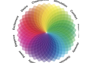
Rodolpho Henrique guides you through the essential aspects of color in digital design and user experience, from the practical steps of creating effective and scalable color palettes to the critical ac

Build a scroll spy in 2 lines of CSS with scroll-target-group and :target-current https://webdesignernews.com/build-a-scroll-spy-in-2-lines-of-css/

Modern development workflows prioritise components, utility classes, and JavaScript-heavy rendering. HTML becomes a byproduct, not a foundation. https://webdesignernews.com/why-semantic-html-still-mat

Lately, as I continue working on adaptive design for the Material system at Google, I’m noticing an intersection between adaptive thinking and generative AI discourse. I think the “create-anythingness

When two creatives collaborate, the design process becomes a shared stage — each bringing their own strengths, perspectives, and instincts. This project united designer/art director Artem Shcherban an

Many teams believe that meeting WCAG standards means their digital products are compliant with the European Accessibility Act (EAA). Using a clear comparison grounded in EN 301 549 and EN 17161, we ex
