Greys. Who doesn’t love ’em? When it comes to building websites, it can be handy having a few shades of grey at your disposal, no matter your colour palette. We use them for borders and subtle dividers, shadows, and to indicate state changes without overwhelming the user with colour. Some designers feel that a website needs quite a few shades of grey in order to convey subtleties. I once worked... https://webdesignernews.com/exploring-the-versatility-of-grey-in-web-design/
Jelentkezéshez jelentkezzen be
EGYÉB POSTS Ebben a csoportban

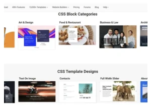
Imagine. Prompt. Create. https://webdesignernews.com/what-do-you-want-to-build/
Web design ideas in 2025 demonstrate a bright and unusual approach. They combine aesthetics, proven functionality, perfect usability, and innovations. Who dictates trends for design developments? Sure
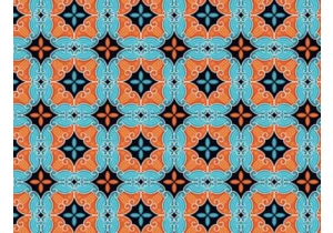
Mosaic designs have an incredible ability to evoke a sense of tradition, craftsmanship, and timeless beauty in any design. https://webdesignernews.com/25-best-mosaic-backgrounds-textures/
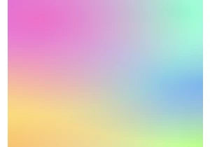
In this tutorial, we’ll learn how to build a fun and interactive mesh gradient generator that you can use to create beautiful mesh gradients and add them to your designs. https://webdesignernews.com/h
We scaled Santa, an open-source binary authorization tool, across all Figmates’ laptops to boost endpoint security while keeping workflows seamless. Here’s how we tackled the challenges and ensured a
It’s time again to share some cool resources and tools for our fellow developers. There are so many cool tools out there to help you build faster, write better code, and stay organized. https://webdes

Instagram hosts over 2 billion monthly active users, making it one of the most competitive platforms for brands and content creators seeking attention. With millions of posts uploaded daily, standing
