As awesome as flexbox is, what it’s doing under the hood is actually a little strange because, by default, it is doing two things at once. It first looks at the content size which is what we would get if by declaring width: max-content on an element. But on top of that, flex-shrink is also doing some work allowing the items to be smaller, but only if needed. Let’s break those two down and see how they work together.
The post Equal Columns With Flexbox: It’s More Complicated Than You Might Think appeared first on CSS-Tricks. You can support CSS-Tricks by being an MVP Supporter.
https://css-tricks.com/equal-columns-with-flexbox-its-more-complicated-than-you-might-think/
Login to add comment
Other posts in this group
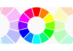

CSS has a number of functions that can be used to set, translate, and manipulate colors. Learn what they are and how they are used with a bunch of examples to get you started.

How do you stay informed of new CSS features when the language evolves quickly and information is spread all around the web? Sacha Greif has some tips from his work running an annual survey focused
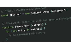
ResizeObserver, MutationObserver, and IntersectionObserver enhance performance over their predecessors. Zell discusses their API similarities, usage steps, refactoring strategies, and advantages wi

We put it to the test and it turns out Sass can replace JavaScript, at least when it comes to low-level logic and puzzle behavior. With nothing but maps, mixins, functions, and a whole lot of math,

The HTML popover attribute transforms elements into top-layer elements that can be opened and closed with a button or JavaScript. Popovers can be dismissed a number of ways, but there

This is the third article in a series about the CSS shape() function. We've covered drawing lines and arcs in previous articles and, this time, we look specifically at the curve