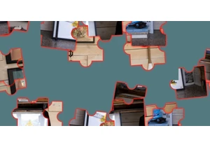
A little while back, Chris shared this nice hexagonal grid. And true to its name, it’s using —wait for it — CSS Grid to form that layout. It’s a neat trick! Combining grid columns, grid gaps, and creative clipping …
The post Hexagons and Beyond: Flexible, Responsive Grid Patterns, Sans Media Queries appeared first on CSS-Tricks. You can support CSS-Tricks by being an MVP Supporter.
https://css-tricks.com/hexagons-and-beyond-flexible-responsive-grid-patterns-sans-media-queries/
Accedi per aggiungere un commento
Altri post in questo gruppo


The reading-flow and reading-order proposed CSS properties are designed to specify the source order of HTML elements in the DOM tree, or in simpler terms, how accessibility tools deduce the order o

Clever, clever that Andy Bell. He shares a technique for displaying image alt text when the image fails to load. Well, more precisely, it's a technique to apply styles to the alt

Shape master Temani Afif has what might be the largest collection of CSS shapes on the planet with all the tools to generate them on the fly.

Some weekend reading on the heels of Global Accessibility Awareness Day (GAADM), which took place yesterday. The Email Markup Con