Digital design is more than just picking the right colors and fonts. It is about using precise calculations to create balance and harmony. Artists have used these ideas for hundreds of years to make things aesthetically pleasing. Today, online architects often use these same golden proportions to make layouts look good and feel just right. This not only makes virtual platforms easier to use, but also fosters an enjoyable experience. https://webdesignernews.com/the-invisible-art-of-web-symmetry/
Accedi per aggiungere un commento
Altri post in questo gruppo
To be honest, I was a smidge skeptical. I know what a design token is. It’s a variable of a color or font-family or something. I pretty much only work on websites, so that exposes itself as a --custom
Transform your website from flat to flourishing with interactive animations that enhance user experience. https://webdesignernews.com/micro-animations-every-web-developer-can-master-with-rive/
I have a confession to make. For the first year or so, I used GitHub Copilot like a glorified spell-checker. A really, really smart spell-checker, sure—one that could write a whole function instead of

We’ve all been there. You find a stock graphic labeled “premium,” pay the extra fee, and then realize it still looks cheap in your design. https://webdesignernews.com/what-makes-a-stock-graphic-truly-
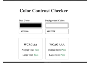
In this tutorial, we’ll create a color contrast tool that lets you check the accessibility and readability of text, by comparing the ratio between background and foreground colors. https://webdesigner

From giant inflatable glyphs to welcoming soundscapes, Figma’s Brand Studio designed an immersive conference that celebrated the spirit of makership at every turn. https://webdesignernews.com/how-we-s
I’m enjoying these FAQ style articles. Today I’m digging into 7 questions that companies have asked me in recent months with the help of Cindy, Garron, Gustavs and Nad. https://webdesignernews.com/faq
