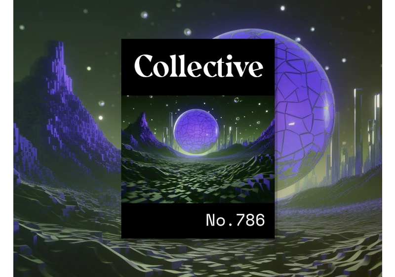
Quentin Hocdé’s website is an amazing showcase of animated pixel art infused with some 3D wizardry. It’s a truly innovative portfolio that exudes a sleek geeky aesthetic, making it our top pick of the week. https://webdesignernews.com/collective-786/

Some people are just realising that the Four Seasons logo actually attempts to represent all four seasons typical temperate regions. No it’s not just a tree. It’s a tree depicted in spring, summer, autumn and winter all at once. That’s why some of the branches have more leaves than others, and some have none at all. https://webdesignernews.com/the-four-seasons-logo-design-secret-is-not-great/

The tech giant announced that it’s offering Android users easier access when clearing their browsing history, letting iOS users make Google Password Manager the default autofill provider and making it easier for all user to access its dark web report feature. https://webdesignernews.com/google-announces-updates-to-privacy-controls-related-to-browsing-history-password-manager-and-more/

It’s important to state that the round corners in Apple’s products are not circular, but instead “squircles”. Squircles are complex curves that remove the discontinuity between the straight and curved sections of a surface. Look at a curved surface that isn’t a squircle and you’ll be able to see where the straight line ends and the curve starts. https://webdesignernews.com/the-secret-formula-for-apples-rounded-corners/

Use these tips for navigation, tables and charts, button UX, and interactivity to create a smooth mobile dashboard experience that will keep users coming back. https://webdesignernews.com/designing-an-intuitive-mobile-dashboard-ui-4-best-practices/


