A significant update is coming to the Windows 11 Start Menu: Microsoft is now testing a wider, scrollable design, complete with the Windows Phone sidebar. This latest change follows the introduction of a “category” view last year, showing ongoing development.
If this sounds like old news, it is, sort of. While Microsoft’s new “category” view within Start was hidden in a build last year, it resurfaced in February when Microsoft announced it would debut in a Windows Insider test channel soon. By April, the wider, scrollable Start menu was unearthed by Twitter sleuths, again as a hidden feature.
In June 2024, Microsoft also began testing a “sidebar” to the Windows 11 Start menu for Android phones, then added iPhone support to the sidebar as well. (Microsoft is also testing allowing users to mirror their Android phones’ screens from this sidebar as well.)
If you’re a member of the Windows Insider program and subscribe to the Dev Channel, this is all coming together: the category view, the wider Start, and the phone sidebar. (Though I added the screen mirroring feature, that’s the only bit left out in the latest build, Windows 11 Insider Preview Build 26200.5641 (KB5060824).
Microsoft
It’s all obviously more than a bit confusing, since Microsoft tests features in various channels, off and on, before an eventual launch. The “Dev” channel is one of the most experimental, so there’s no guarantee you’ll see these features anytime soon. Just know that Microsoft is playing with what works and what doesn’t inside the Start menu, and you can be part of it if you choose.
A little flexibility comes to Start
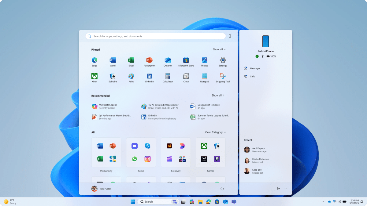
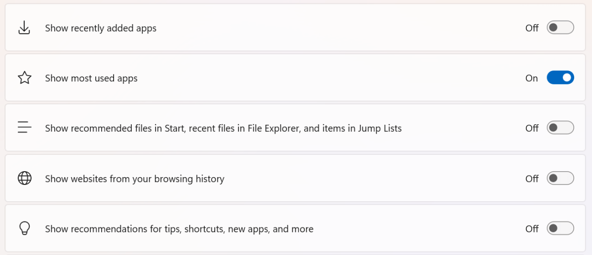
Basically, Microsoft is testing a more responsive Start menu. If you pin apps, you’ll see those on top. If you don’t, you may see the “Pinned” row shrink. Underneath those apps, Start will continue to include “recommended” files—but you can turn those off inside the Windows Settings, too, via a toggle.
Microsoft
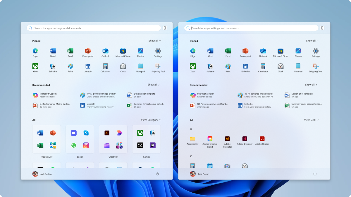
Underneath the “recommended” files will be a list of “all” apps, organized into one of two views: Category or Grid view.
Category view will use AI to group apps into cards. Microsoft’s example uses “productivity,” “creativity,” and “social.” The grid view feels more like the Start menu of old. There won’t really be a “grid” of apps, but they’ll be arranged alphabetically: all of the “A” apps together, then the “B” apps, and so on.
If you have a large or widescreen display, the Start menu will stretch wider than it has before.
“Have a larger-screen device? You can expect to see a larger Start menu, by default, so you can see more of your apps and files,” Microsoft said. “On larger devices, users can expect to see eight columns of pinned apps, six recommendations, and four columns of categories in the Start menu. On smaller devices, you’ll see six columns of pinned apps, four recommendations, and three columns of categories.”
If you have a mobile phone, you’ll also be able to push the small “phone” icon and open up the sidebar, where you’ll be able to access messages, calls, and possibly more.
https://www.pcworld.com/article/2808379/windows-11s-start-redesigns-are-all-coming-together.html
Zaloguj się, aby dodać komentarz
Inne posty w tej grupie
AI-generated summaries are low-hanging fruit for apps and services th
Flash drives are kind of dull as a topic, the modern descendant of fl
Your PC can now see what you’re looking at on the screen, if you choo

In a recent
