Well, color me this! I was griping to myself last night about just how gosh dang hard it is to read text messages in Apple Messages. You know, not the blue bubbles that you get when messaging other iPhone users. …
Apple Messages & Color Contrast originally published on CSS-Tricks, which is part of the DigitalOcean family. You should get the newsletter.
Autentifică-te pentru a adăuga comentarii
Alte posturi din acest grup

Layout. It’s one of those easy-to-learn, difficult-to-master things, like they say about playing bass. Not because it’s innately difficult to, say, place two elements next to each other

I was playing around with scroll-driven animations, just searching for all sorts of random things you could do. That’s when I came up with the idea to animate main headings and, using scroll-driven

This is the fourth post in a series about the new CSS shape() function. So far, we’ve covered the most common commands y
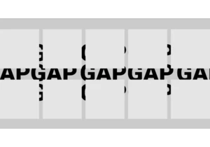
Styling the space between layout items — the gap — has typically required some clever workarounds. But a new CSS feature changes all that with just a few simple CSS properties that make it easy, ye

Being the bad boy I am, I don't take Tailwind's default approach to cascade layers as the "best" one. Over a year experimenting with Tailwind and vanilla CSS, I've come across what I believe is a b


KelpUI is new library that Chris Ferdinandi is developing, designed to leverage newer CSS features and Web Components. I've enjoyed following Chris as he's publishe
