Utilizing icons in user interface elements is helpful. In addition to element labeling, icons can help reinforce a user element’s intention to users. But I have to say, I notice a bit of icon misalignment while browsing the web. Even …
Improving Icons for UI Elements with Typographic Alignment and Scale originally published on CSS-Tricks. You should get the newsletter.
https://css-tricks.com/improving-icons-for-ui-elements-with-typographic-alignment-and-scale/
Chcete-li přidat komentář, přihlaste se
Ostatní příspěvky v této skupině
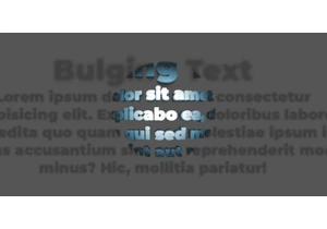
In this third and final chapter, we’re stepping into interactivity by adding JavaScript, starting with a simple :hover effect, and ending with a fully responsive bulging text that foll

In this chapter, we will explore ways to animate the effect, add transitions, and play with different variations. We will look at how motion can enhance depth, and how subtle tweaks can create a wh

A client asked me to create a bulging text effect. With a bit of cleverness and some advanced CSS, I managed to get a result I’m genuinely proud of, which is covered in this three-part series.


