The way we access the internet has changed dramatically. No longer are desktops the primary access point; mobile devices now dominate, and tablets occupy a significant middle ground. This shift necessitates a fundamental change in how we design websites. A one-size-fits-all, fixed-width design is no longer sufficient. Instead, responsive web design has become essential. This article provides data-driven recommendations for optimal website design widths and breakpoints in 2025, to help... https://webdesignernews.com/optimizing-website-design-widths-for-a-multi-device-world/
Chcete-li přidat komentář, přihlaste se
Ostatní příspěvky v této skupině
Think “user” and “customer” are the same thing? Think again. Confusing the two could be the silent killer of your product—and your profits. Here’s why designing for the wrong journey could cost you ev

A recent study reveals why well-designed AI explanations often go unused and what it means for UX practice https://webdesignernews.com/why-users-ignore-ai-explanations/
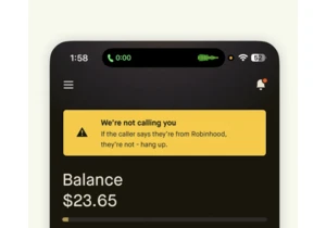
A few days ago, I opened my finance app to check my card details. Nothing unusual about that. Except this time, I was already on a call. https://webdesignernews.com/a-simple-perfectly-timed-design-dec

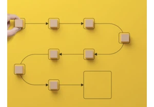
If you’ve ever opened a B2B app and felt like you were fighting a maze of menus, tabs, and dashboards — you’re not alone. Traditional navigation was once the backbone of digital products. But today, i

Hope you’re having a good week so far. This edition I loved the deep dive into the State of CSS 2025 results, with :has() rightly in the spotlight. https://webdesignernews.com/state-of-css-2025-

Flexbox is a one-dimensional layout tool, used for arranging elements in a single row or column. It is best suited for simple, one-dimensional layouts and smaller-scale projects. https://webdesignerne