
 — Part 4: Close and Move")
 — Part 4: Close and Move")
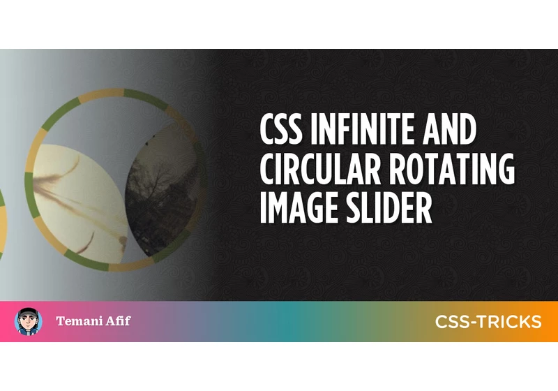
Image sliders (also called carousels) are everywhere. There are a lot of CSS tricks to create the common slider where the images slide from left to right (or the opposite). It’s the same deal with the many JavaScript libraries out …
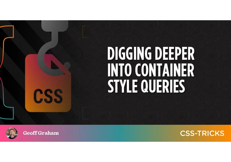
I wrote up some early thoughts on container style queries a little while back. It’s still early days. They’re already defined in the CSS Containment Module Level 1 specification (currently in Editor’s Draft status) but there’s still a couple of …
One of the main goals of the WordPress Site Editor (and, yes, that is now the “official” name) is to move basic block styling from CSS to structured JSON. JSON files are machine-readable, whi
I’m a sucker for anything about front-end job titles.
CSS evolved and we’re beyond the point where everyone can just do it as a side interest. We all can learn it and build amazing stuff with it,
…
HTML lists are boring. They don’t do much, so we don’t really think about them despite how widely used they are. And we’re still able to do the same things we’ve always done to customize them, like removing markers, reversing …
Newer Things to Know About Good Ol’ HTML Lists originally published on CSS-Tricks,
Well, color me this! I was griping to myself last night about just how gosh dang hard it is to read text messages in Apple Messages. You know, not the blue bubbles that you get when messaging other iPhone users. …
Apple Messages & Color Contrast originally published on CSS-Tricks, which is part of the

Well, hey check this out. Looks like there is a brand spankin’ new blog over at WordPress.org all about WordPress development. In the original proposal for the blog, Birgit Pauli-Haak writes:
The Make Core blog has a heavy
BEM. Like seemingly all techniques in the world of front-end development, writing CSS in a BEM format can be polarizing. But it is – at least in my Twitter bubble – one of the better-liked CSS methodologies.
Personally, I think …
Taming the Cascade With BEM and Modern CSS Selectors originally published on
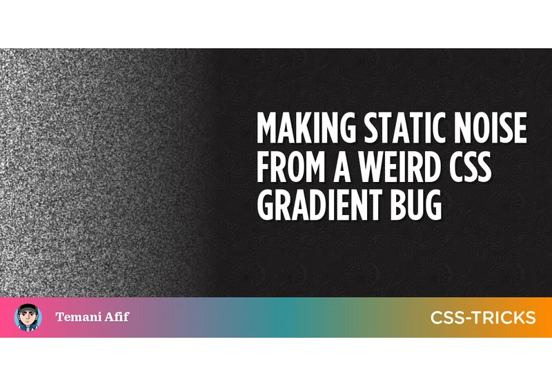
What I will be doing here is kind of an experiment to explore tricks that leverage a bug with the way CSS gradients handle sub-pixel rendering to create a static noise effect — like you might see on a TV with no signal.
Making Static Noise From a Weird CSS Gradient Bug originally published on CSS-Tricks, which is part o