


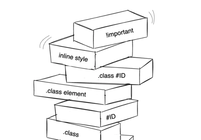
When writing CSS, it’s close to impossible that you haven’t faced the frustration of styles not applying as expected — that’s specificity. You applied a style, it worked, and later, you try to override it with a different style and… nothing, it just ignores you. Again, specificity. https://webdesignernews.com/css-cascade-layers-vs-bem-vs-utility-classes-specificity-control/

Social media is no longer just about eye-catching single posts; it’s about creating experiences that draw people in and keep them engaged. https://webdesignernews.com/story-based-social-posts-designing-narratives-for-swipeable-content/
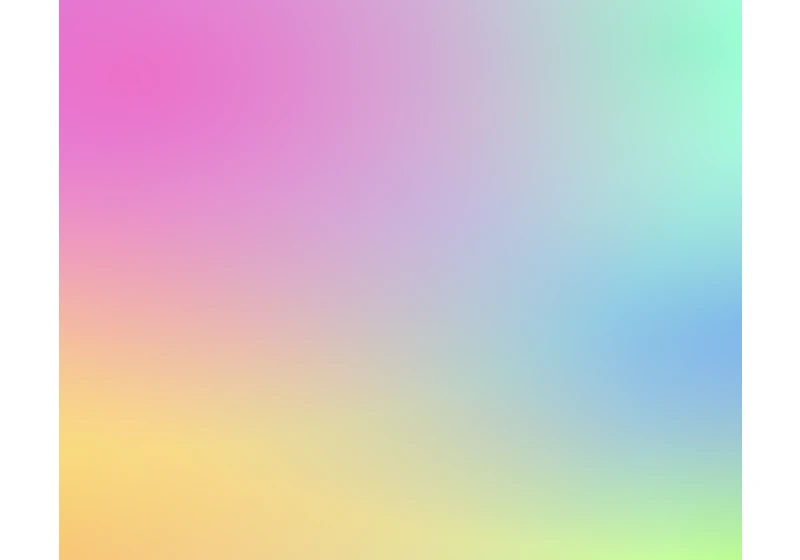
In this tutorial, we’ll learn how to build a fun and interactive mesh gradient generator that you can use to create beautiful mesh gradients and add them to your designs. https://webdesignernews.com/how-to-create-a-mesh-gradient-generator-in-html-css-and-javascript/

Imagine your user is cooking, their hands are covered in flour, and they want to add milk to their shopping list app. They can’t touch the screen. What if they could just say, “Hey, Listify, add milk to my shopping list”? Just like that, it’s done. https://webdesignernews.com/give-your-app-a-voice-a-guide-to-integrating-ai-voice-apis/

“I didn’t have high expectations for this career nor did I think I could make a living from it,” says Mexico City-based graphic designer and illustrator Matias Funes. “Life proved me wrong, and over time, my passion and love for design grew enormously.” https://webdesignernews.com/artist-spotlight-matias-funes/
Responsive web design is the latest trend in web design. RWD uses flexible layouts that adapt to different screen sizes. A responsive website adjusts its layout based on the device being used to view it. In addition, RWD designs adjust their content automatically depending on the size of the viewing window. https://webdesignernews.com/7-types-of-web-design-how-to-make-2/
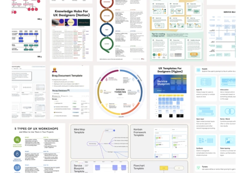
Summary: Overreliance on frameworks as universal solutions rather than adaptable starting points undermines critical thinking and threatens our field’s intellectual rigor. https://webdesignernews.com/how-template-culture-is-dumbing-down-ux/
The Microsoft Edge team is excited to announce that CSS gap decorations, a new way to style the gaps between items in flex, grid, and multi-column layouts, is now available for developer trial in Chrome and Edge 139! https://webdesignernews.com/a-new-way-to-style-gaps-in-css/
A huge part of building for the web is making experiences responsive. Usually, we think of responsive design in terms of making sites adapt to different viewport sizes, but what about being responsive to different mediums too? https://webdesignernews.com/printing-the-web-making-webpages-look-good-on-paper/
I mean, obviously they aren’t literally the same, but you also probably won’t be surprised that they have different behavior as well. And yet…. they do kinda basically do the same thing. Two equal width columns. https://webdesignernews.com/1fr-1fr-vs-auto-auto-vs-50-50/